Simply put, this article is attempting to explore what makes an image look “good,” and what aspects of analog film inherently contribute to creating an aesthetically pleasing image..
What parts of an image captured on film are inherently different than digital? And how do these inherent differences impact the image we’re capturing? By looking at how film captures and affects luminance, color, and texture, we can try to better understand what really makes an image “look good.”
Some Disclaimers, Definitions, and Ideas
- First and foremost, this post has been sponsored by Dehancer, a film emulation platform. As a result, all film emulations were done through Dehancer. See more about this here.
- I am not a color scientist, nor do I play one on the internet. These are just my own experiments – take things with a grain of salt or give me feedback.
- When I say “film” I am referring generally to the medium of image capture that is analog film. Does not matter if it’s still or motion picture, positive or negative film, 35mm vs large format, so on and so forth.
- Good Looking Image = Perceived Depth
The Film “Look”
Does a singular look of film even exist?
When speaking to people about image quality, they can describe their desired image as having a “film look”. If asked to define this more clearly, they may talk about soft highlights, film grain, or tinted shadows. Oftentimes however, they can’t lay out a measurable definition of what a “film look” really is.
Part of this is because a “film look” doesn’t truly exist. The same film stock shot on different lenses, with different development and scanning, can look vastly different. It’s impossible to truly nail down.
Despite this, people often tend to have their own idea of a film look in their head. They sometimes will even have a sense that film inherently looks good – or even better than digital in some cases, despite not being able to nail down what makes it look the way it does.
Oftentimes, there is an intangible appeal to analog film that’s difficult to put our fingers on as the average image enjoyer…
Defining What a “Good Image” Is
For the sake of today’s discussion, we need to establish a working definition of what makes an image “look good” in order to explore this idea any further.
Determining whether an image looks good involves numerous tangible and intangible factors, making it impossible to fully define.
Depending on the one’s preferences, the lighting in the room, or even the color of the light in that room they’re looking at the image in, two people can give wildly different answers to whether or not a certain image looks good.
As an attempt to strip all of that discussion back, my current definition of what makes an image look good, at least for today, is effectively depth.

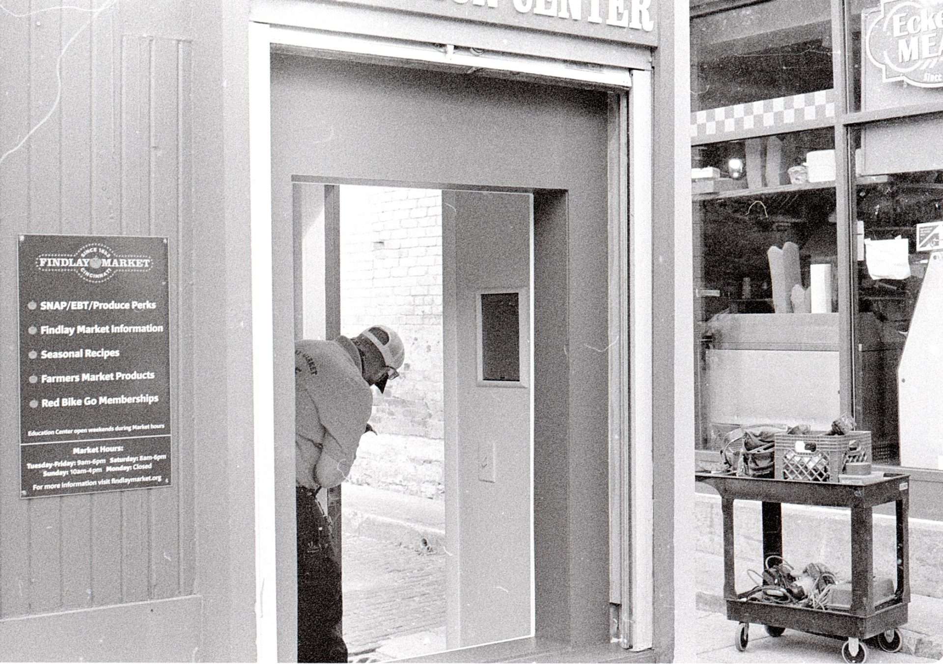
Minolta X-700 on Kodak T-Max 400
For This Discussion: A Good Looking Image = An Image With Perceived Depth
The image should feel like it has depth to it. It should feel tangible, like you can reach out and touch it. This can be done through layering of elements, luminance contrast, color separation, texture, and any other number of things.
Throughout this article, when I refer to what makes an image look good, I am primarily addressing the perceived depth within the image.
From there, we can begin to look at things that create this perceived depth. This will allow us to explore the underlying mechanisms and how analog film interprets these elements to enhance depth.

Minolta X-700 on Kodak Tri-X 400
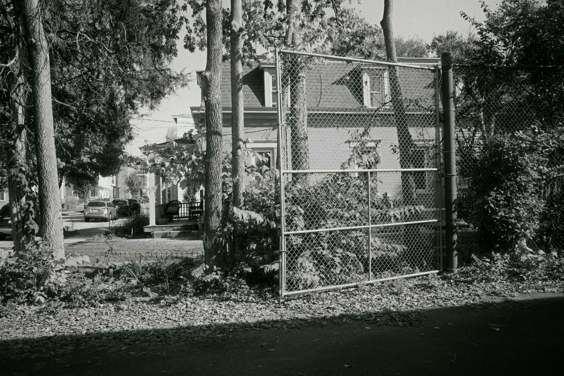
Ricoh GRiii w/ Ilford HP5 Plus 400 Emulation
Film versus Digital: What’s Better?
Surrounding the discussion of analog film you may hear the question asked: what’s better: film versus digital? Ultimately, it depends on the desired outcome. It’s a question linked directly to the purpose of your image and it’s audience.
Depending on what image output you are looking for, both mediums could accomplish it, but may offer their own pros and cons on the way to getting that image output.
Digital can often be seen as a faster and more stable image pipeline. The pipeline has less room for error. You can’t have your camera back malfunction and open in light to ruin your digital images the way you could with analog film for example.
Digital sensors also tend to offer a higher ceiling on data capture. Capturing a wider dynamic range, more color bit depth, and having it in a flexible medium that can be potentially be manipulated further in post without breakage certainly has it’s benefits
As for film, often the look of the image and its colors, the feel of the contrast, and some of the more intangible qualities of the image are often discussed. The deliberate shooting process with film also requires you to slow down and think through your shots more. A quality that many people (myself included) quite enjoy.
Digital Sensors and The Data Capture Arms Race
An optimization towards data capture rather than aesthetic.
That being said, I think the key difference lies in digital’s optimization towards data capture.
This isn’t to say that film hasn’t improved in data capture over time, but I’d argue data capture isn’t the primary driver of the industry in the same way that it is in digital sensors.
Just take a look at the ‘digital camera arms race’ for higher megapixels or dynamic range just to have it on the spec sheet.
Another example of this is the existence of log state footage. Its primary function is optimizing for data capture. As a result, the footage is flat, desaturated and aesthetically pleasing. Its entire function is to capture data in absence of aesthetic, so that you can optimize for aesthetic down the line in your digital image pipeline.
On the other side of this discussion, the film industry has spent decades improving its technology where aesthetic preference is one of the major factors of the technology.
By aiming to produce aesthetically pleasing images without relying heavily on digital post-processing, the industry has optimized for aesthetic preference in ways that digital has not. This is part of the reason why so many different film stocks exist.
If you compare different types of film stocks to camera profiles or presets that come with modern digital cameras, you’re likely hard-pressed to find presets from two camera manufacturers that look as different as Lomochrome Purple and Portra 400, for example.
The point here is that shooting film isn’t just a “hipster trend,” done because it’s cool and challenging, nor is it a worse medium simply because digital is newer technology.
With decades of study and development around specific aesthetics, why would we throw out those aesthetic ideas just because there is a new medium for creating an image? If our desired output – a good looking image – is the same, why not consider all the ideas available?


The above two images are shot on a Blackmagic Pocket Cinema 6k, in Blackmagic’s Gen 5 film color science. An encoding optimized for data capture. As a result? Flat and desaturated, devoid of aesthetic – which is built later in the image pipeline.
Utilizing Film’s Optimization for Aesthetic
When emulating film in digitally shot images, you often encounter the valid question: why use an older generation of technology and try to recreate it with the newer version?
The new version is intuitively seen as “improved” technology. Why invest the effort to recreate the old medium? Why not simply use the new technology or stick with the old one?
In my opinion, this relates to what we just discussed. Film photography and imaging has decades of experience, work, and innovation dedicated to optimizing images to look good. Other people have spent time researching and developing these images to recreate colors and light in a certain way that, at least at the time, people felt looked good.
Now that we have digital photography, why discard all that information and those ideas about what makes an image look good simply because the medium has changed? The goal of creating an aesthetically pleasing image remains the same in both scenarios.
Only the medium used to create the image has changed—the end goal stays consistent. Whether the image is processed by a digital sensor and stored on a memory card, or shot on a film camera, exposed to a roll of film, we still want a good image.
So why would you throw out all the ideas and knowledge of film processing, which laid much of the groundwork for understanding what makes an image look good?
If we choose to shoot digital photos or video, we can still utilize this groundwork. With the increased data capture of digital cameras and digital sensors, we have the option to take the things from film that we like, such as color palette and contrast, and do away with the imperfections—such as grain, scratching—that we may not like.

Ricoh GRiii, Kodak Portra 800 Emulation

Ricoh GRiii, Kodak Portra 800 Emulation
Studying Elements of Depth Across Film and Digital
As I mentioned earlier, if we define a good looking image as an image that has perceived depth, we can begin to use that depth as a proxy to study what makes an image look good.
Outside of compositional elements, an image can create depth through contrast in luminance and color. It’s the difference between light and shadow and differences between colors that create this depth.
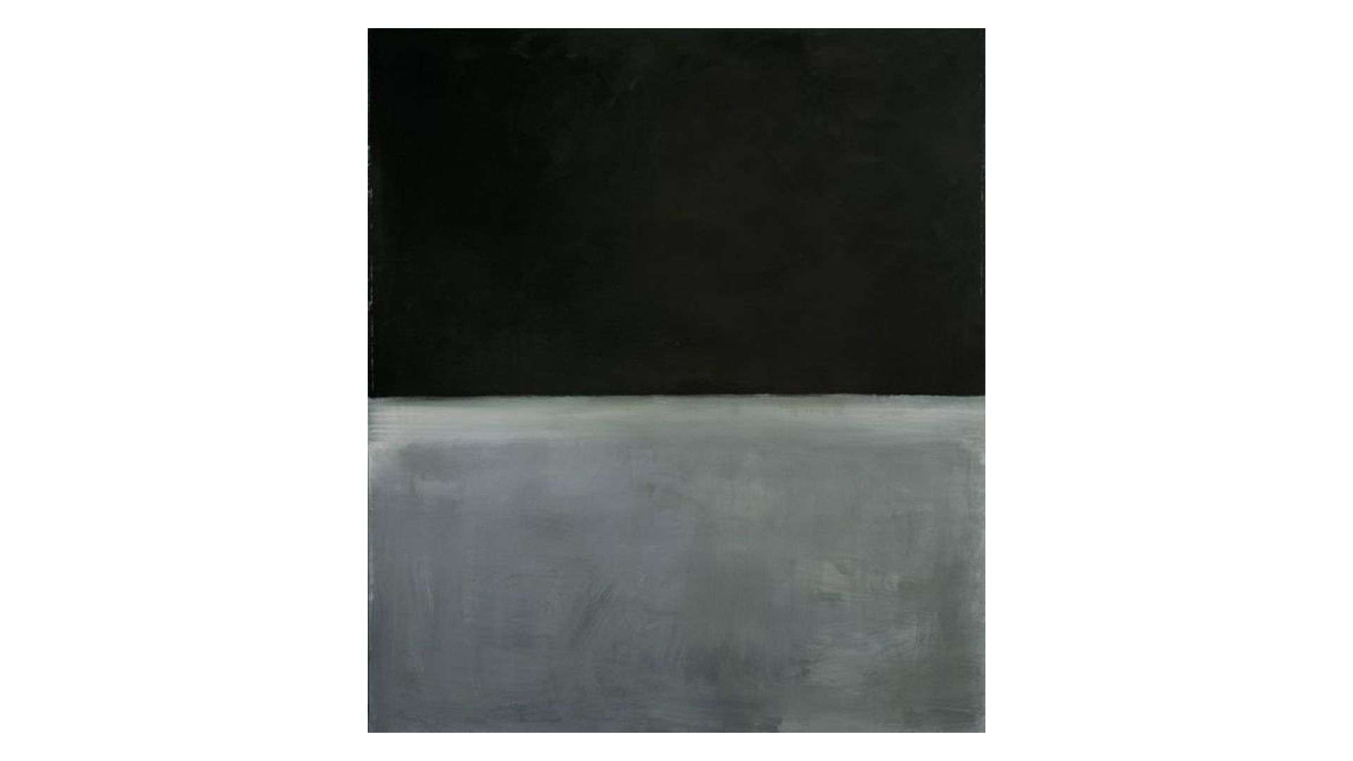
Take a look at the below paintings by Mark Rothko. I feel that mark’s paintings help illustrate this idea of depth through contrast in isolation from layering of objects and composition – at least the best that we possibly can.
In the first one here, Untitled, we have the absense of color, with only a black and grey blocks. Despite such little information being present in the frame, it still feels like there’s just enough here to find a sense of depth to the flat image.
Similarly we have the painting “Number 61.” While relatively similar lumanice values across the three colors, we have distinct differences in hue. Particularly the red and blue – notably approaching opposite each other on a color wheel. Not quite, but still a large jump in color contrast.
And again, there seems to be just enough to find that feeling of depth.

Achieving Luminance Contrast From An Intermediate Color Space
To simplify the discussion, I want to take a look at how film is “interpreting” contrast information across luminance data. To do this, I took the same shot of a chart and compared the transformation to Rec.709 with several film stock profiles using Dehancer.
Of course this requires us to rely on Dehancer’s color science – though from what they’re doing I don’t doubt it. Though I do also plan to do a version of this test on various film stocks in the future to add to this comparison in the future.

Next, I extracted the luminance values from the middle exposure strips, which in my Spyder Checker Photo chart consists of 10% steps (plus a 5% step at 5% black).
I then analyzed the changes from an intermediate color space (in this case, DaVinci Wide Gamut Intermediate) to the final image output. While any of these profiles or transforms could create an aesthetically pleasing image from a DWG image, comparing the differences reveals _how_ it happened. From here, we can begin to draw conclusions.

The first thing of note is that all profiles tend to increase global contrast by raising highlight values and lowering shadow values. However, there is greater variance in how each method achieves this global contrast increase. The ratios and areas where contrast is altered, and the degree of change, vary from chart to chart. These differences in handling specific regions create smaller pockets of contrast with distinct characteristics between charts or images.
You will also notice that the neutral (Rec.709 transform) image still exhibits these regional variants, similar to a film stock, though in different ways.
This ultimately points to achieving the same goal: an increase in global contrast with regional variations. However, the extent of the contrast increase and the degree of variation throughout the spectrum are managed in their own unique ways.
Some Notes, Flaws, And Future Updates With The Study
In the future, I plan to revisit this study to examine saturation versus luminance and explore methods to analyze changes in hue. I also want to perform the same study while incorporating developed film. I’ll be revisiting and updating this post at a later date.
If you’re reading this (and I know that you are), I have yet to do this.
You can find the latest version of the experiment, including spreadsheets, charts, and data, over on GitHub.
- There are a few potential flaws in the study that I’ll try to correct when I conduct it again:
- I wasn’t highly scientific in maintaining consistent middle grey.
- The lighting conditions for my chart weren’t very precise.
- I’m not a color scientist, so some underlying assumptions could be incorrect. I’m just a guy on the internet doing experiments.
Conclusion
Does film really look “better” than digital? What’s the real difference.
Ultimately, when discussing why some people may say that film looks better than digital, it comes down to a lot of different variables. You can approach it from numerous angles beyond what we discussed today.
In my opinion, it still has some level of intangibility. Any combination of factors could make film look more like digital or digital look more like film, depending on the equipment used and the viewer.
So, at the end of the day we’re chasing an ever-moving target, trying to nail it down. Nevertheless, I spend an inordinate amount of time thinking about these things, so it was a fun topic to explore.
The Plug: Using Dehancer For Film Emulation
If you want to dig more into digital film emulation, as I mentioned up top this post was sponsored by Dehancer.
Dehancer makes a film emulation tool that I’d actually used on some color work in the past. Exploring this idea was bouncing around in my head around the time they reached out, so it seemed like a no brainer to put this together.
For this article and many of the images used here, I used Dehancer for Davinci Resolve, though their platform works with a variety of systems outside of Resolve (Capture 1, Affinity Photo, Final Cut Pro, iOS, etc).
Feel free to check out their website here.
If you decide to purchase their product, feel free to use the affiliate code RKCOLOR to get 10% off, and help support my work.

